
This guide will show you how to make use of an SQLite database using the litedb node on the FRED hosted Node-RED platform to create database tables and store data. Under the hood, the litedb node uses SQLite. As a very lightweight relational database, Continue reading “Tutorial: Using SQLite with FRED (Node-RED)”
Tag: dashboard
Tutorial: A Node-RED dashboard using node-red-dashboard
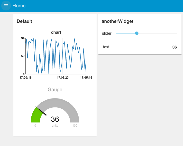
This is a simple example of reading and visualizing data using the new UI nodes from node-red-dashboard. We’ll be using the Cloud based FRED service as our Node-RED engine and visualizing a simple random data feed to show how to create a simple dashboard that looks like this:
NOTE: For existing FRED users – This is the new version of the UI nodes that many of you might be already using. The old version of UI nodes are still available(and it is still named as “UI nodes”, but the link to the old UI dashboard is changed to “/red/legacy_ui/“.
The sample flow of this tutorial can be found in this link.
Other approaches
If you are looking for more ideas on how to create dashboards using Node-RED, check out the dashboard lecture in our lecture series. It explores three approaches to dashboards – this approach which uses the built in dashboard nodes, the use of a third party dashboard tool – freeboard. And a generic approach that uses a javascript charting library and the http in/out nodes. All lectures are available at: http://noderedguide.com/
- There’s also a tutorial on graphing multiple lines on the same chart with the chart node. http://noderedguide.com/tutorial-node-red-dashboards-multiple-lines-on-a-chart/
- one on creating your own UI widget to install on the dashboard using the template UI node
- and one on creating a UI widget that uses an external charting library to install in your Node-RED dashboard
What is Node RED?
Node-RED is a visual tool for wiring the Internet of Things developed by IBM Emerging Technology and the open source community. Using Node-RED, developers wire up input, output and processing nodes to create flows to process data, control things, or send alerts. It works by allowing you to wire up web services or custom “nodes” to each other, or to things, to do things like:
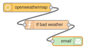
- Send an email on a rainy weather forecast.
- Push sensor data to services like Twitter.
- Perform complex analysis on data with ease.
If you’re new to Node RED you might find our Introduction to Node RED tutorial very helpful.
What is FRED
Front End for Node-RED (FRED) manages instances of Node-RED for multiple users in the cloud. We manage and optimize your instance of Node RED so you worry about accomplishing your project, not setting up and maintaining your Node-RED instance.
Create a FRED Account
To begin our tutorial create your own Node-RED instance in the cloud. Register for a free account at http://fred.sensetecnic.com.
After registering make sure to activate your account via your email. You will not be able to login until you validate your account.
About Sense Tecnic: Sense Tecnic Systems Inc have been building IoT applications and services since 2010. We provide FRED, cloud hosted Node-RED as a service to the community. We also offer a commercial version to our customers, as well as professional services. Learn more.
Introduction to the dashboard nodes from node-red-dashboard
Let’s start by looking at the node-red-dashboard nodes and getting a simple dashboard setup.
To start, let’s wire up a simple flow that sends a random number between 0 and 99 to a simple chart. For that you’ll need an inject node to repeatedly fire every few seconds, a function node to generate the random number and one of the node-red-dashboard nodes – in this case the chart node.
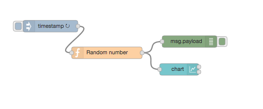
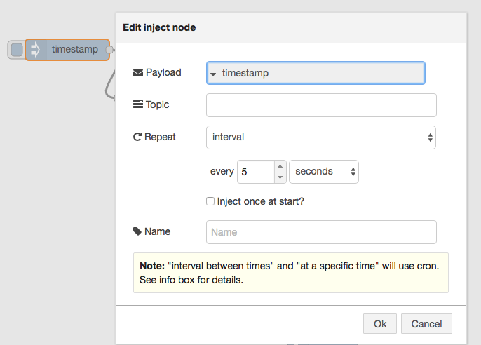
Before we look a how the chart node works, let’s configure the inject node to send a timestamp every 5 seconds by setting the payload to timestamp and the repeat field to an interval of 5 seconds.
This will act as our repeating trigger. Now we need to set up the function node to generate a random number – we’ll use a simple JS math function to do this:
msg.payload = Math.round(Math.random()*100);
return msg;
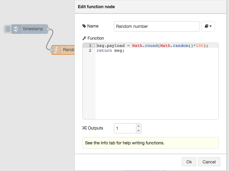
That will generate a random number between 0 ~ 99 which is passed to the chart node.
So now let’s take a look at the chart node. When you double click it, you’ll see it’s configuration options: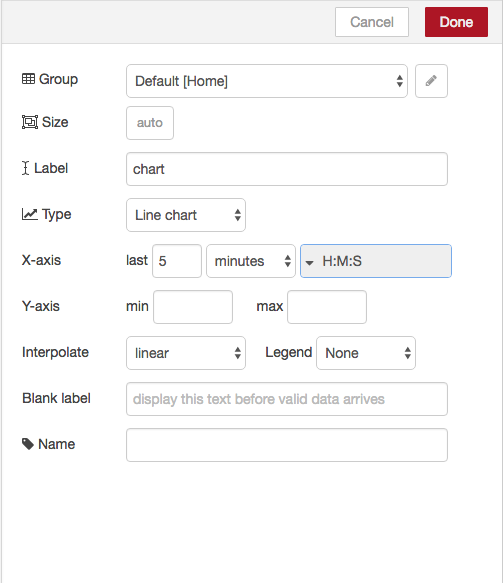
If you click on the button of the Group field, you will be prompted to configure the tabs of the UI.
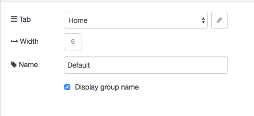
The Tab option allows you to specify which tab of the UI page you will see the UI element on – in this case our chart. The default tab is Home – which we are using here. If you select the edit button to the right of the Tab field you can create a new tab and then select that. However, we’ll use the default home for now.
The Name field is the standard Node-RED node name – by default this is chart but you can set it to anything you like.
The Group field allows you to group UI elements – we’ll show you how that works when we add another UI element so let’s use group “Default[Home]” for now – of course, you can use any string you like.
The X-asis field allows you to tell the chart how much data it should store and display – the longer the ‘last‘ filed is set to, the more data is stored and displayed by the chart. Let’s use a short 5 mins which will start to throw away the data that is 5 minutes old.
Lastly the Interpolate field defines how the chart will interpolate values in between actual data values it receives, you can select between linear, step, b-spline and cardinal – which are standard interpolation algorithms. We’ll use the default linear.
Wire these nodes up, hit the deploy button – check that your debug node is showing that random values are showing. Then head over to your default dashboard page to see the results. By default, under FRED, you’ll see your UI at:
https://{username}.fred.sensetecnic.com/api/ui/
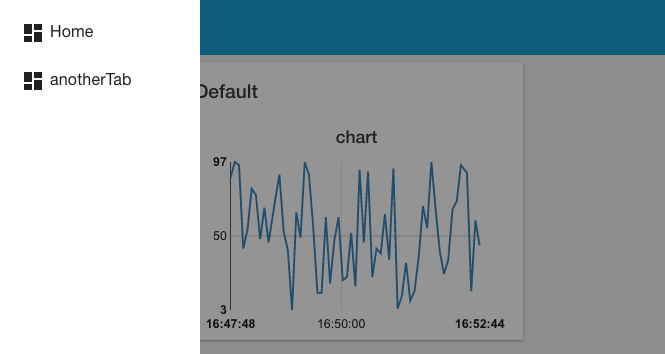
When you visit that page you’ll see your initial chart as shown below:
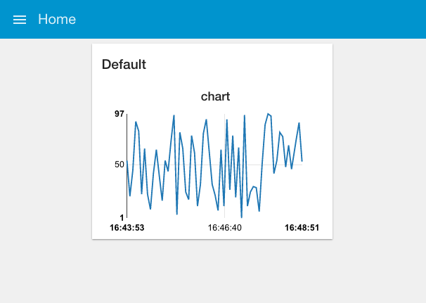
As you can see, you get a nice line chart, scaled for your data values (X axis) and the time they arrived (y axis). You can also see “Default” at the top left of the chart, indicating this is UI group “Default” – which is the group name we set in the configuration fields for the chart node.
If you look at the top left of the web page, you can see that we are, by default, on the home tab. If you had created your own tab then when you click the selector top left you’ll get a pull down menu of your tab options:
That was pretty simple, let’s add a few other UI elements to our dashboard. Firstly let’s create a gauge to show the last data value sent. Drag a Gauge node from the UI palette and wire it to the Random Number function node.
Then double click to open up and let’s configure it:
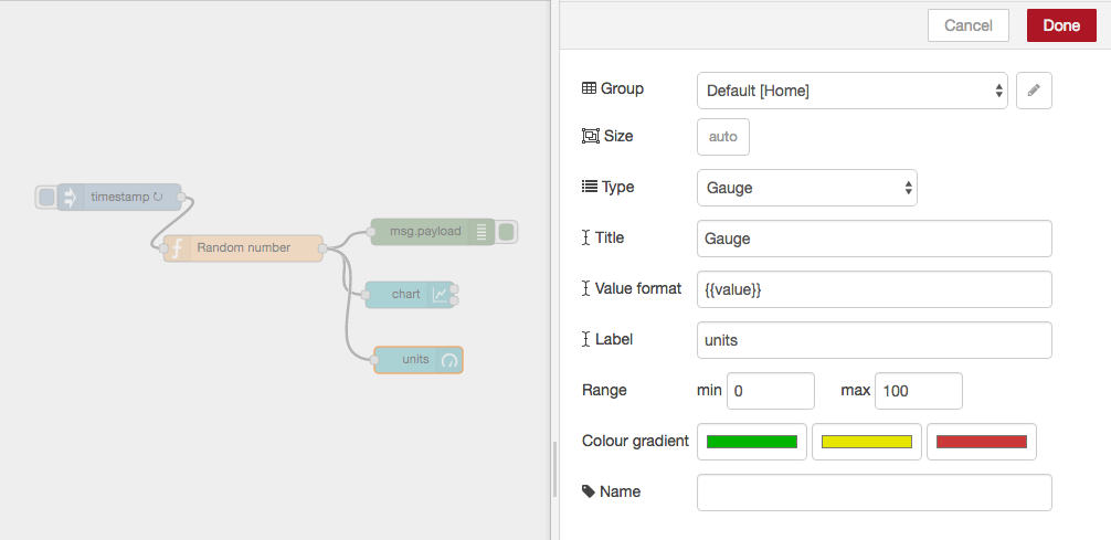
We’ll us the same Tab, home and we’ll also add it to the same group – “Default[Home]”. The Min and Max fields allow you to set the min and max values the gauge will shown. Make sure the max is set to 100 which is the most that the random number function node will generate. You can also change the Colour gradient to show different colours on the widget, but we will leave it as default for now.
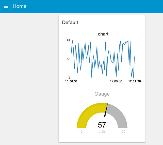
Hit deploy and then head over to your dashboard and you’ll see that the chart and gauge are displayed in a group with the chart now showing the last 5 minutes of data and the gauge the latest value.
As a last example, let’s use a couple of the other UI nodes, a slider node and a text node to show the same data on a slider and as a text string.
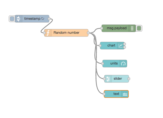
For these two nodes, configure them to use the same tab – “Home” but use group name “anotherWidget”(You will need to click “Add new UI_group” from the drop down menu of the Group field, and then click the edit button). You will also need to change the min and max value for the slider node to show the correct position of the slider. Deploy those and let’s take a look at your dashboard. As you can see, we now have two widget groups, group “Default” with a chart and a gauge, group “anotherWidget” with a text filed and a slider. Simple eh?
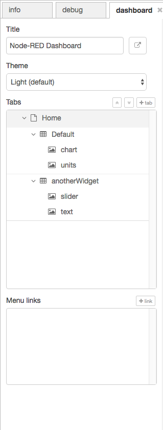
In the dashboard tab beside your debug tab, you can also set the theme and order of the elements. If you don’t see the dashboard tab, click the menu button at top right corner, then select “View” -> “Dashboard”. You can see all the widgets and tabs showing in a tree structure, and you can easily drag the elements to change the orders that they are presented in the dashboard.
Now you’ve got the basics sorted out, play around with the different dashboard elements to build your own dashboards using some real world data – have fun!
Other approaches to dashboarding
If you are looking for more ideas on how to create dashboards using Node-RED, check out the dashboard lecture in our lecture series. It explores three approaches to dashboards – this approach using the built in dashboard nodes, the use of a third party dashboard tool – freeboard. And a generic approach that uses a javascript charting library and the http in/out nodes. All lectures are available at: http://noderedguide.com/
- There’s also a tutorial on graphing multiple lines on the same chart with the chart node. http://noderedguide.com/tutorial-node-red-dashboards-multiple-lines-on-a-chart/
- one on creating your own UI widget to install on the dashboard using the template UI node
- and one on creating a UI widget that uses an external charting library to install in your Node-RED dashboard
About Sense Tecnic: Sense Tecnic Systems Inc have been building IoT applications and services since 2010. We provide FRED, cloud hosted Node-RED as a service to the community. We also offer a commercial version to our customers, as well as professional services. Learn more.